Looking for some advice?
Despite the ongoing challenges presented by Covid19, we’re here to help. If you’re working on a large format project, and have any questions, please get in touch via our contact form – our expert project managers are on hand to answer any of your questions.
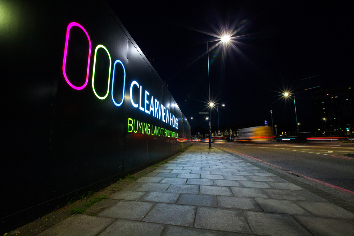
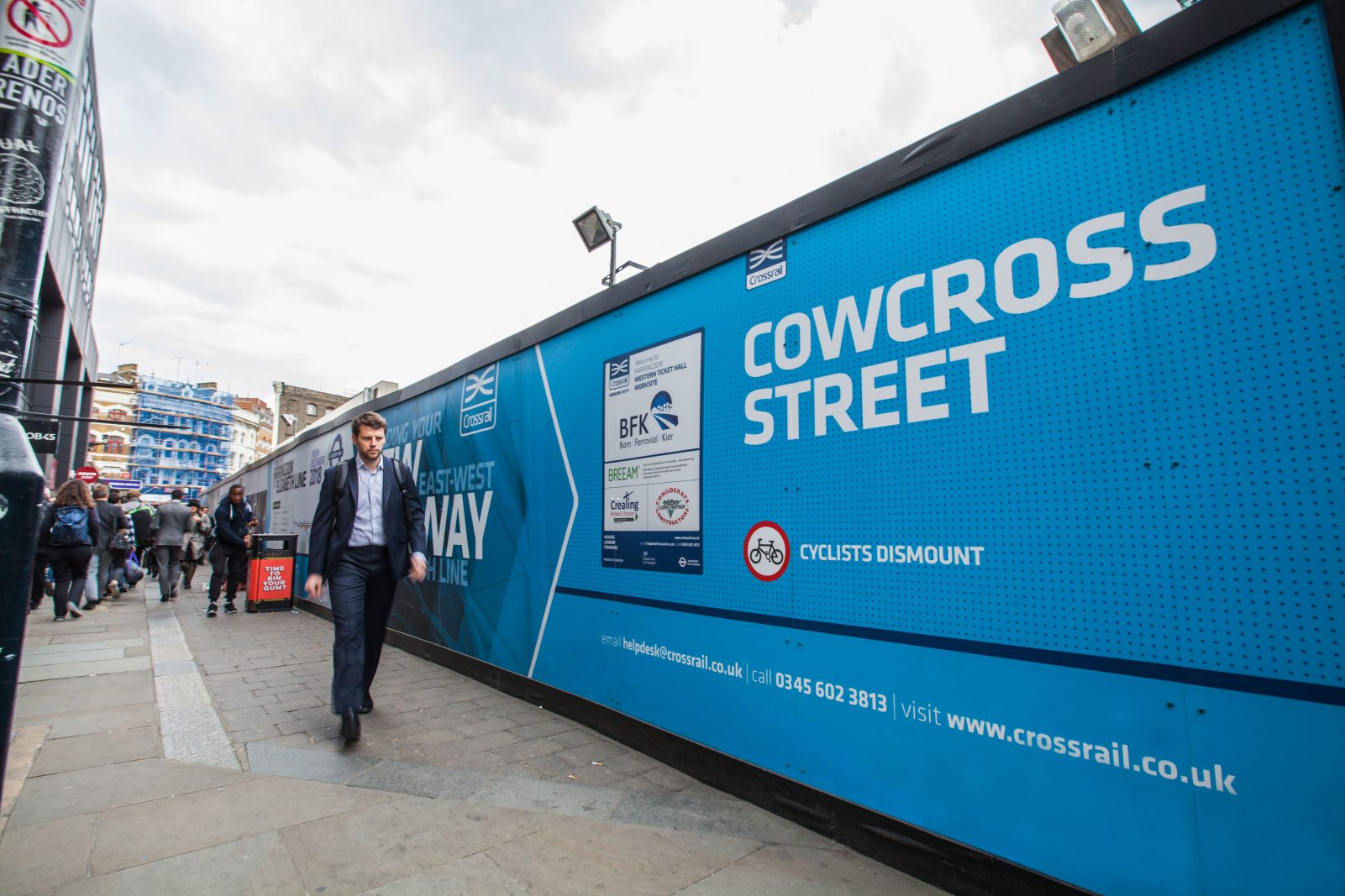
The hoardings that surround a construction site don’t have to just be unmarked boards that tick the health and safety boxes – they also represent golden opportunities for messaging and advertising.
The size and length of hoardings makes them a natural fit for large-format outdoor advertising, but not all advertising is created equal. We see marketing messages constantly in our modern world – and you don’t want yours to get lost in the noise.
So what can be done to ensure your hoarding graphics are effective?
Clarity
With all forms of outdoor advertising, it’s important to keep the messaging as clear as possible. The graphics will usually be displayed in a public place, where people might be passing at speed, seeing it from the corner of their eye or approaching from a variety of angles – or under any number of lighting conditions.
It follows that any advert that can’t be digested and understood in a matter of a few short seconds may not communicate very well. Passers-by may not generally be in the habit of stopping to give your advertisement their full and undivided attention, and your graphics shouldn’t require too great of an investment of energy to understand.
Partly, this is an issue of the graphic design itself – making sure that text is clearly readable from a distance, for example, and that visual elements are kept distinct and uncluttered. It is a good idea to consider the surroundings of the construction site and pick colours that will stand out or at least complement the scenery without disappearing into the background – and not leave key visual elements to be hidden behind a bench or some other item of street furniture.
However, a dedication to the idea of keeping things clear and simple can also extend to the actual concept of the advertising – a well-designed and visually readable advertisement will still miss the mark if people don’t intuitively ‘get it’. Overly elaborate metaphors can work well in some types of advertising, but for large-format outdoor adverts it’s often best to keep the messaging uncomplicated.
Clear objectives

More often than not – unlike many other forms of marketing – hoarding advertisements are not so much intended to promote a particular product or service as to bolster public awareness or brand recognition.
Either way, it pays to clarify what the desired outcome of the new advertisement would be and design your messaging around that goal. If it’s a promotion for a specific product or service, calls-to-action might be appropriate – ‘call us today’, ‘order online’ and so on. On the other hand, an awareness campaign might be more concerned with communicating business values and ethos – in which case, simple messaging and ‘mood imagery’ might be the order of the day.
Even though you technically have a large ‘canvas’ for your advertisement, the need to keep things simple and to not over-clutter the design will necessitate being quite specific about what is and is not included in the scope of the messaging. The most effective designs are those created with a clear, defined goal in mind.
Unique and beneficial
We’ve touched on the need for your hoarding advertisement to stand out visually as a distinct and noticeable part of the environment, but it’s also vitally important that your message should stand out conceptually.
Simply put – what’s special about your product, service or brand? Why should the customer consider you and not your competitors? What is your unique selling point (USP)? This is the heart of all forms of advertising.
It can be a good idea to try to address both what is different about the subject of your advertisement, and also what is beneficial about it. How might the product, service or brand benefit the people who see the hoardings – and is that clear from the design?
Whether your product is the cheapest, your service is the most efficient or your brand is the most eco-friendly, your USP should come through loud and clear in your hoarding graphics. Even if you’re not promoting a specific offer or service, and instead are trying to increase brand awareness, it’s a good idea to use things like slogans or key messages to effectively communicate your brand ethos.
A design that can ‘breathe’

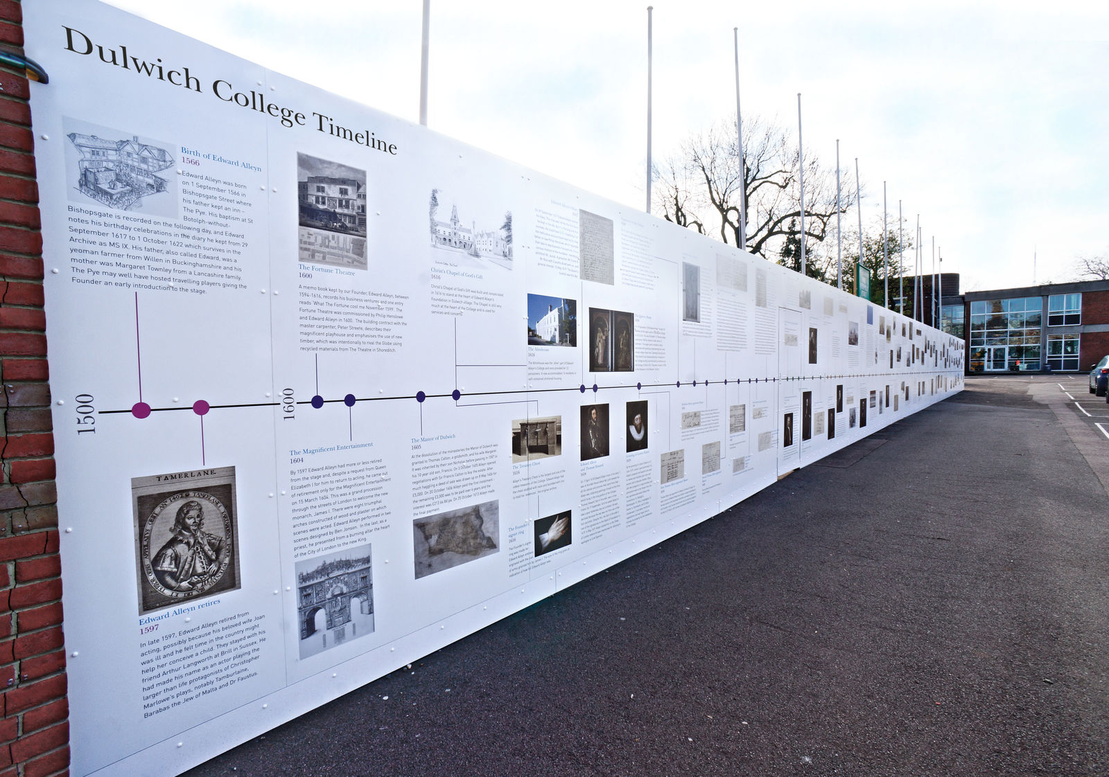
Hoarding boards represent a very large space for advertising, but don’t make the mistake of feeling obligated to fill every corner with ‘useful’ design elements.
Leaving a lot of empty space in a design can actually be beneficial – as it draws the eye to the few elements that are present – and good design can often be more a matter of deciding what to remove than what to add.
It’s not just a matter of aesthetics; all kinds of outdoor advertising needs to read well from a distance. Cramming lots of details onto the design might work for a passer-by who happens to be right next to the boards, but viewed from the other end of the street your hoardings are likely to be a jumble of unreadable elements and unclear messaging.
Clear and uncluttered advertising design can speak volumes about the confidence and professionalism of your company in a way that an over-engineered layout may not – and hoarding graphics are a unique opportunity to make a big, bold statement to anybody who passes by.
Show it, don’t say it
There is an old writer’s maxim that it’s better to ‘show, not tell’ when writing fiction, and this principle applies just as well to advertising. Especially for outdoor adverts such as hoardings and billboards, you often only have the viewer’s attention for a few seconds – so don’t give them too much reading to do.
While the saying ‘a picture is worth a thousand words’, might be a cliché, it is still perfectly true. Rather than trying to explain your concept with written messaging, it may be simpler and more intuitive to simply represent it with an easily-understood image that illustrates the idea.
Not only can images often be understood more intuitively than words, studies show that they also tend to be easier to remember – a psychological phenomenon known as the picture superiority effect.
At the end of the day, construction hoardings represent a great opportunity for messaging and raising brand awareness. The generous size and shape of the medium allows for a myriad of possibilities and a great chance to reach the general public with your advertising.
By keeping your design simple, clarifying your objectives and making obvious the aspects of your service or brand that are unique and beneficial, you can enjoy the advantages of a successful construction hoarding advertisement and reach huge numbers of passers-by with your message.