Looking for some advice?
Despite the ongoing challenges presented by Covid19, we’re here to help. If you’re working on a large format project, and have any questions, please get in touch via our contact form – our expert project managers are on hand to answer any of your questions.
In all creative industries, there’s an art to striking a balance between a proposal that fits the intended purpose while also pleasing the client. Construction site hoardings are a fairly niche and specific field for designers, and there are a few key elements that are vital to designing a graphic that ticks the right boxes.
You’ll need an understanding of the specific requirements of the brief in question, as well as a knowledge of the types of designs that both suit construction hoardings and are likely to be approved by local councils. Whether you’re working on your first hoarding brief, or are simply looking for some additional tips, here’s how to design a hoarding graphic that your clients will love:
Understand your client’s brand
This is hardly a revelatory piece of insight, and it doesn’t just apply to construction hoarding graphics; it’s a principle that applies to any creative work undertaken by an agency or consultant. When designing a hoarding graphic, it’s first vital to understand three things: who your client is, what they do, and what they want their hoarding graphic to achieve.
Aside from the obvious (i.e what purpose they would like their design to actually serve), key considerations should include:
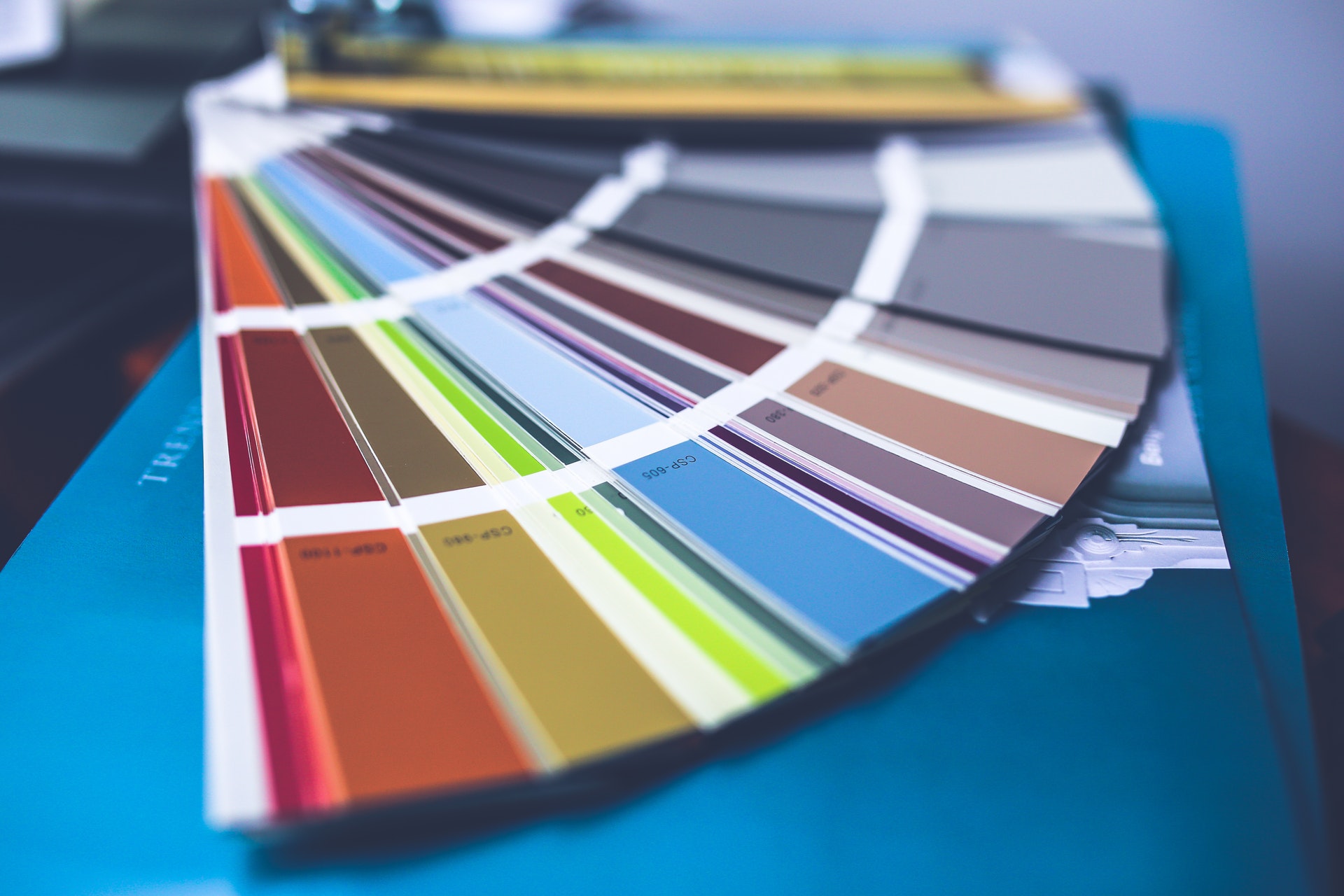
Visual branding
Depending on the actual brief you’ve been given, and the amount of creative freedom you have, factoring in your client’s branding might be a valuable – if not essential – element to work into your design.
Make sure to obtain images of their logos and any other relevant graphic elements you may need to work into your designs – and ensure these are in the right format and are of high enough quality to be scaled for large-format printing, which usually implies vector (.esp) files.
It’s also a good idea to request any relevant branding documents the company may be able to supply, as these can help you understand how to use different colours, fonts, and shapes appropriately in your work.
Tone of voice
It’s usually the case that any copy for the advert will be supplied with the brief, and it’s unlikely that a client will expect a graphic designer to write any content for them (so you can exhale that sigh of relief). Regardless, it’s a good idea to understand the tone of voice your client adopts in their advertising and branding more broadly, as you can use this to inform your own work. It also show your client that you’ve done your homework about who they really are, and how their values are best represented.
Do they use a formal, high-end tone, justifying an elegant design? Do they embrace elements of humour? Do some research by reading some content from your client – whether it’s on their website, social media, or in printed form – and if applicable, request any substantiating tone-of-voice documents or information to give you a clearer picture.
Research the location of the hoarding

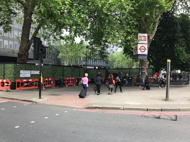
An appreciation of where the hoardings will be displayed is also an important factor into the way you approach the design of the graphics. The position of the hoarding relevant to potential passersby will dictate how the design should be composed, and the aesthetic qualities of the surrounding environment will have an impact on what will – and won’t – look good.
For example, a graphic printed along a roadside, with little potential pedestrian traffic, will usually call for a simpler and bolder design that can be seen from a passing car. Large fonts, images, and logos will therefore be more appropriate.
It’s also worth thinking about how you can ensure your designs fit in aesthetically with the local environment. This is something that is often required by local councils, and taking steps to actively adapt your hoarding to ‘fit’ is an important step. This can involve using things like similar colour palettes and visual themes, or even creating visual ‘facades’.
The key takeaway of this is research. If it’s practical, try to visit the site in person, or at least request as much visual documentation as you can. Even tools such as Google Maps can be useful to develop as clear a picture of the site for the hoardings as possible.
Factor in the practical restrictions

One of the biggest challenges when designing a hoarding graphic lies in meeting the practical requirements that apply to its printing and display. Taking the time to factor these into your initial designs can make the difference between leaving your client with that all-important first impression, and having them tearing their hair out in frustration.
Fundamentally, you’ll need ensure that your designs will translate both digitally and physically into a large printed format. That means using the right software, and sending your work to your client (or the printing firm) in the right format. Adobe software including InDesign and Illustrator is often a go-to choice, and vector (.eps) files are the ideal format due to how well they scale.
You’ll need to obtain detailed information on the size and dimensions on the hoardings in question, and factor these into your work. If the site boundaries for the hoardings will need to change or be moved, your designs may need to be flexible in the way they connect to one another. Ask the client if this is something you’ll need to consider, as this can save time and money on avoidable reprinting.
Understand the rules and regulations
As hoarding graphics are legally classified as outdoor advertisements, they are subject to a number of regulations as to what can and cannot be featured and displayed. For some more detailed info on this, take a look at our article on the rules and regulations for construction site hoarding graphics.
Speak to your client about what they want the designs to feature, and then discuss whether the local authority has been – or needs to be – contacted. It’s usually a good idea to have a discussion with the local authority as to the nature of the graphic you’re designing. Your work may automatically qualify for approval, but you also might need to make some changes and alterations at the advice of the local council.
Put together a watertight proposal

While this again applies to work you do for any client, when it comes to construction hoarding graphics, the brief is particularly important. Given that it may be used as a supporting document to submit to the local authority, there are certain things you should think about well in advance.
You should include the usual information you supply, such as mood boards, initial concepts, and design elements – but also consider the specifics of the hoarding itself. Show how your graphics will be printed and will fit together, and take steps to demonstrate that you’ve factored the physical requirements of the graphics into your work.
It’s also wise to show how you’ve considered the local environment and surrounding areas into your work, whether this is translated to your actual designs or not. Detail any research you’ve done, and how you’ve taken the setting into account when working on the graphics.
Effective design examples:
There are few better ways to demonstrate how effective a graphic can be than by looking at some specific examples, so here are a couple of approaches to hoarding graphics that have proven highly successful in the past:
Graphics that preview the finished building:
A site hoarding doesn’t just present a valuable outdoor advertising opportunity, but also a chance to connect the ‘work in progress’ construction site to the finished project. A hoarding graphic that contains a visual representation of the building being constructed is a great way to demonstrate what the works taking place are for.
There are a number of creative ways this can be approached, such as by creating a physical timeline of the construction project that pedestrians can read and look at as they walk along it. You could also dedicate specific panels or sections of the hoarding to specific areas of focus, or to different aspects of the building’s intended usage.
Graphics that blend into the local environment:
One of the most common points of contention that local authorities have with hoarding graphics is the extent to which the they assimilate with the local surroundings, with designs that ‘blend in’ more likely to receive approval. As such, a highly effective and visually pleasing way to adhere to this is to design a graphic that seamlessly links to the space in which it is displayed.
There are a number of ways this can be achieved. You could design a graphic that actively camouflages with the surrounding environment, such as this hedgerow design:
Alternatively, you could be slightly more creative. This hoarding design uses colour samples from the urban landscape around it, and employs them in a ‘dazzle’ camouflage design (for more info on this one, see our Tideway Case Study):

Conclusions
Ultimately, as with any project, your designs will need to meet the brief your client has given you. But when you hand over your initial proposal, the steps you’ve taken to ensure your work fits the brief – and also all of the other implicit factors in hoarding advertising – will be what leaves your client most impressed.
If there’s one lesson to take away from this, it’s that the best designers don’t just create great-looking hoarding graphics: they go the extra mile to understand what other factors are at play. Above all, what stands out is how they can adapt their designs to make the lives of their clients – whether they’re a printer, a contractor, or a business – as easy as possible.