Looking for some advice?
Despite the ongoing challenges presented by Covid19, we’re here to help. If you’re working on a large format project, and have any questions, please get in touch via our contact form – our expert project managers are on hand to answer any of your questions.
Advertising, in its many different forms, is one of the most creative industries out there. The fundamentals are simple: create an advert that conveys a simple message, to make people more aware of your business, and your brand will thrive. While every advertising channel presents huge opportunities for originality, few can compete with the sheer impact of outdoor advertising, and in particular, hoarding graphics.
We see construction site hoardings regularly, but only when they’re adorned with eye-catching graphics do we really notice them. From simple branded designs to unusual and innovative works of art, at PressOn, we’ve printed and installed countless hoarding graphics over the years. We thought we’d take a look at just a few of our favourites, and explore why they stand out so much:
Harrods ‘vault’
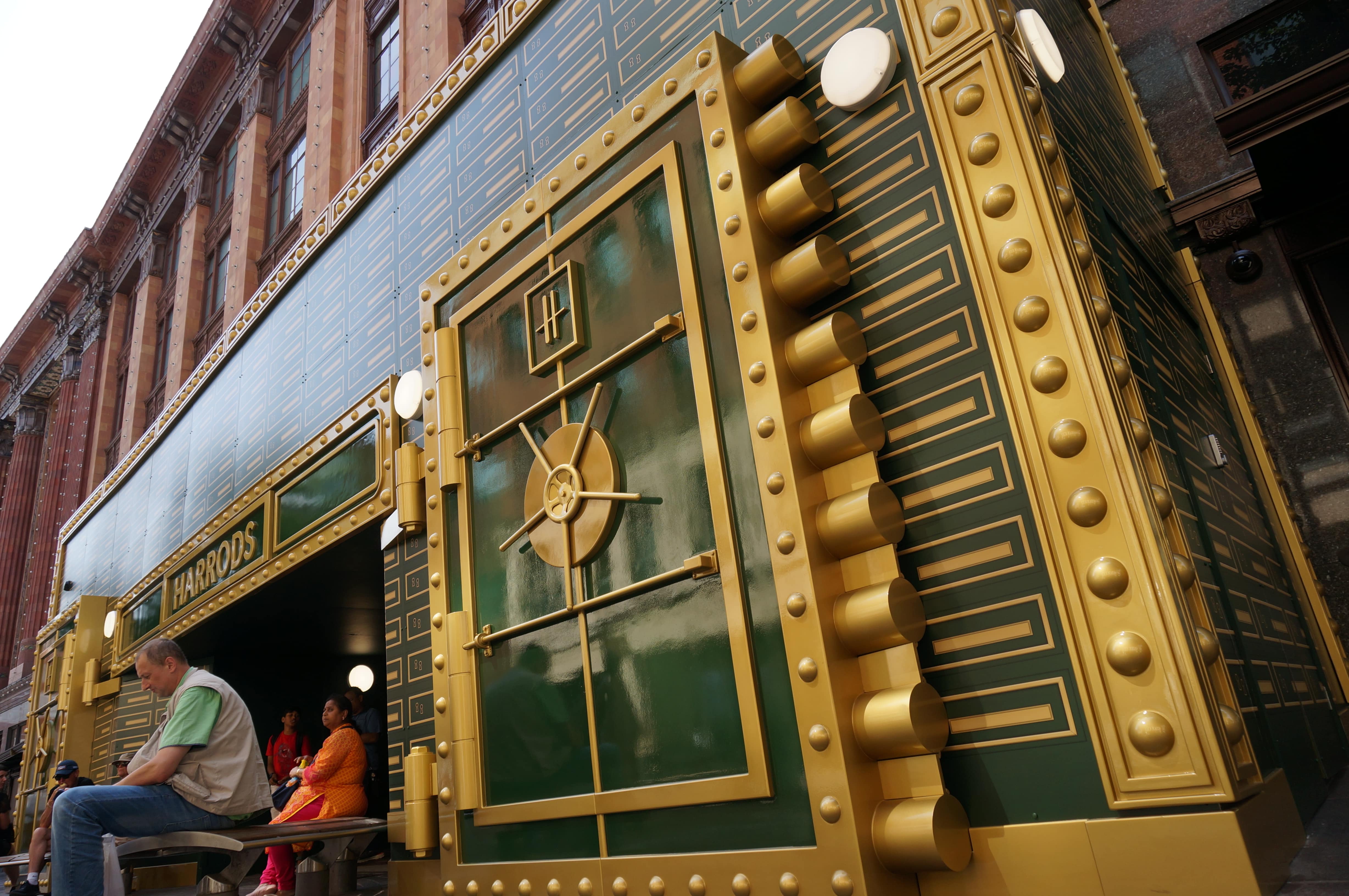
Hoardings don’t always have to advertise a product or a brand – sometimes, they can be used as a tool to immerse and enthral passersby. The ‘Vault’ we worked on for Harrods is without a doubt one of the most unique and exciting hoardings we’ve ever worked on, and it doesn’t even feature any writing…
To put the design in context, Harrods were undertaking work on one of the entrances to their iconic London store which required the installation of some site hoardings. To remain true to their brand aesthetic and reputation for exceptional customer experience, Harrods decided that rather than install a simple set of boards, they would create something more special.
Taking inspiration from a series of window displays they had created recently (which involved ‘lockboxes’ as a central design motif), Harrods came up with a conceptual three-dimensional hoarding which would take the shape and appearance of an enormous bank vault door.
Why is it so effective?
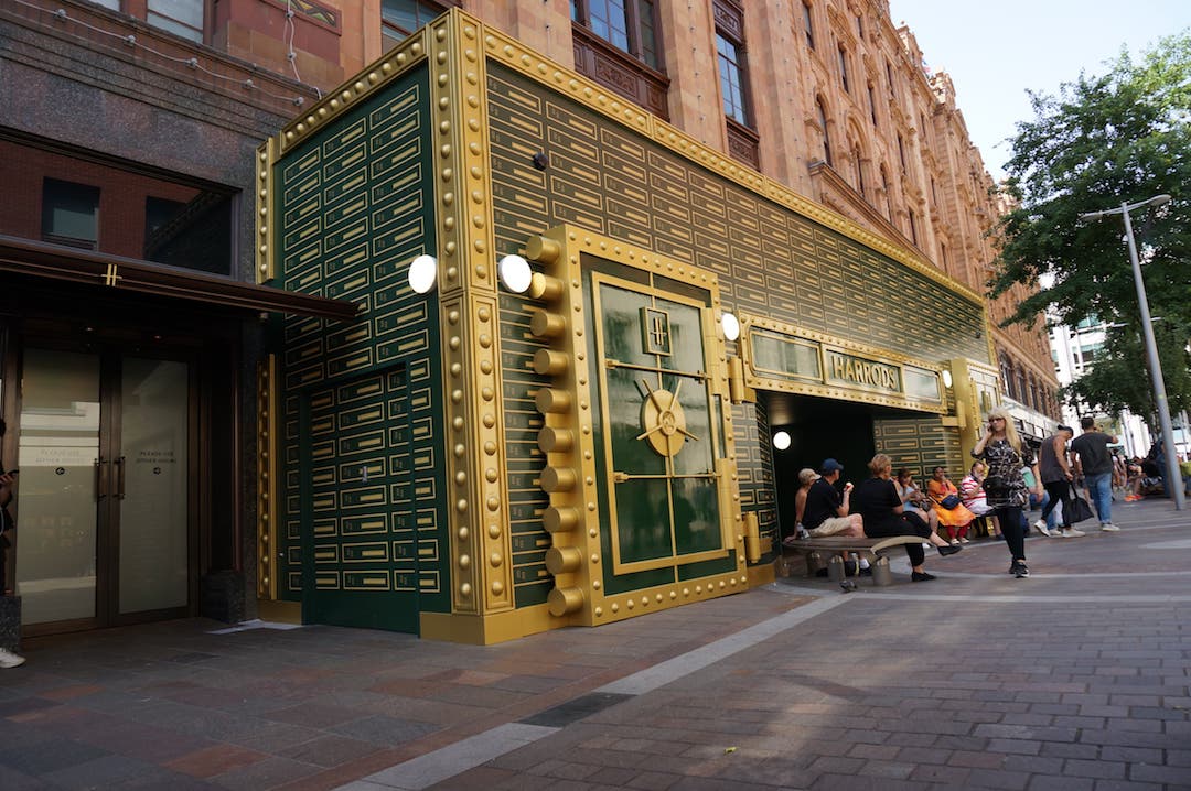
With graphics printed by PressOn, the installation was created in collaboration with 3D Eye Limited – and the result was exceptional. Rather than be greeted with an unattractive safety board, Harrods’ customers instead had the experience of walking into a lifesize bank vault, adding a level of immersion to their customer journey. It’s this kind of experiential approach to retail that customers remember, and it’s particularly exciting to see brands adopting this approach with their hoardings, as well as with one-off installations within the stores themselves.
This hoarding manages to attract new customers, it creates a talking point, and it turns a potentially ugly installation into one that makes people even more interested in the store and what’s taking place. It’s particularly effective because of how well it reframes the perception of a construction site – these are often seen as hubs of dust and debris, and they’re certainly not inviting spaces. The visual impact of the hoarding, though, with its connotations of treasure and precious goods hidden within, turn this potentially negative perception on its head.
As hoardings go, this one is pretty special.
Clearview’s backlit hoardings
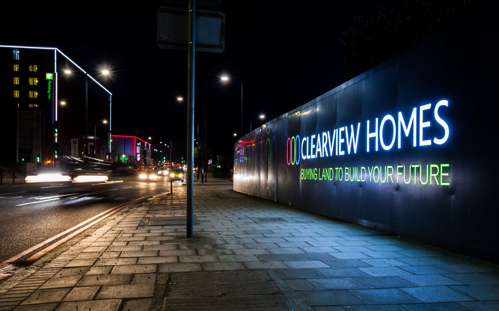
It’s not always the most elaborate or unusual hoardings that are the most effective. While large-scale installations or beautiful graphics can certainly make an impact, one of the key things about hoardings is how effective they are at communicating their message and achieving their goals.
With this in mind, we thought we’d ‘shed some light’ on a project we worked on, which made the most of some thoughtful design. Hoardings are easily seen (provided their graphics are well-designed) by passersby and those in passing vehicles during the daytime – but at night, things can get a little tricky.
One of the best things about hoardings is that they can be seen 24/7, but only if they’re well lit. Clearview opted for a design that put a fantastic spin on simply lighting the front of the hoardings – they turned things inside out, and lit the wording of their graphics from behind.
Why is it so effective?
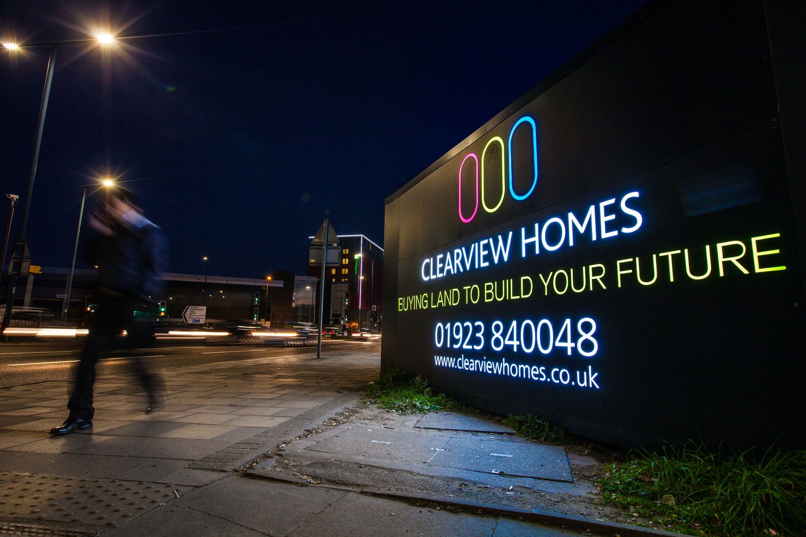
It’s not unusual to see backlit signs, but hoardings are a different story – lighting isn’t always given the attention it should, so it’s really inspiring to see a brand make such effective use of this principle. It’s even more exciting to see it done with such a bold and impactful design.
By using a bold, simple graphic with a really high level of contract, Clearview ensured their hoardings were unmissable both during the day, and the night. There’s no over-complication of the designs, and by using black as the background colour, when darkness falls, it looks as though the writing is ‘floating’ on its own.
It also demonstrates that hoardings aren’t simply a ‘throwaway’ set of boards, purely built to shield the site within from sight. They’re an impactful and elegant installation in their own right. Brilliant stuff.
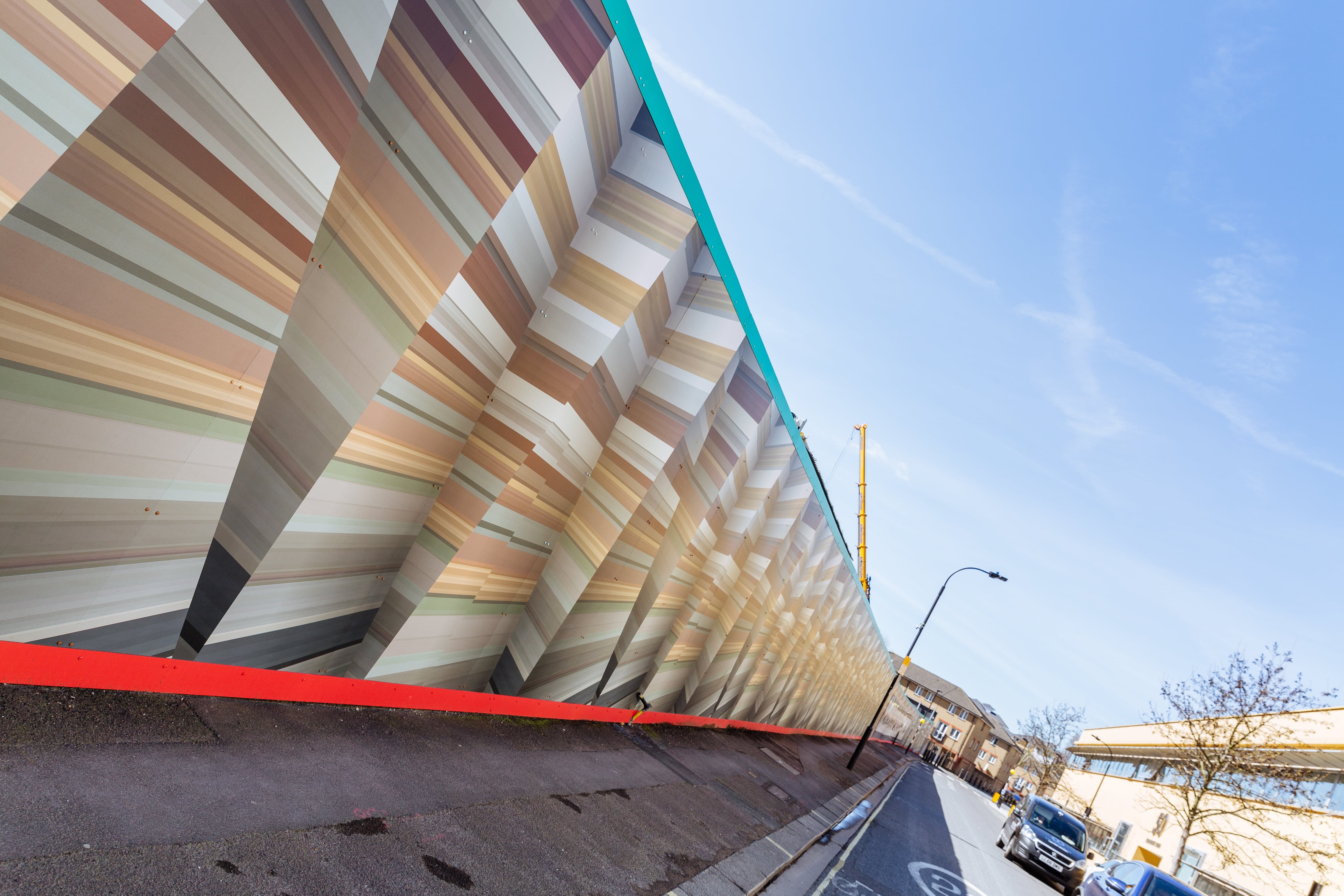
Tideway’s ‘dazzle’ camouflage hoardings
Hoardings have to tick a number of boxes, and there are all kinds of rules and regulations that need to be considered to ensure local councils and authorities grant permission for the designs to go ahead. Some of these are obvious (no inappropriate imagery and so on), but others involve careful dissection and understanding.
Importantly, many local authorities will require some level of consideration of the local ambience and aesthetic. What this means is the designs on a set of hoarding graphics can’t ‘stick out’ too much, or detract from the natural visual quality of the environment in which they’re placed – even if that’s an urban space.
This is particularly true in London, with its rich and diverse aesthetic and character. Tideway, the company behind the new super sewer set to relieve the burden on the massively overstretched and outdated existing system, needed to install hoardings on a large number of sites across the city – and they needed to ensure the graphics they used blended in effectively.
They implemented a ‘dazzle’ design, which featured a sharp angular pattern replicated across the various hoardings. Different colours were used carefully to ensure the hoardings made an impact, but didn’t contrast too strongly with the surrounding areas.
Why is it so effective? 
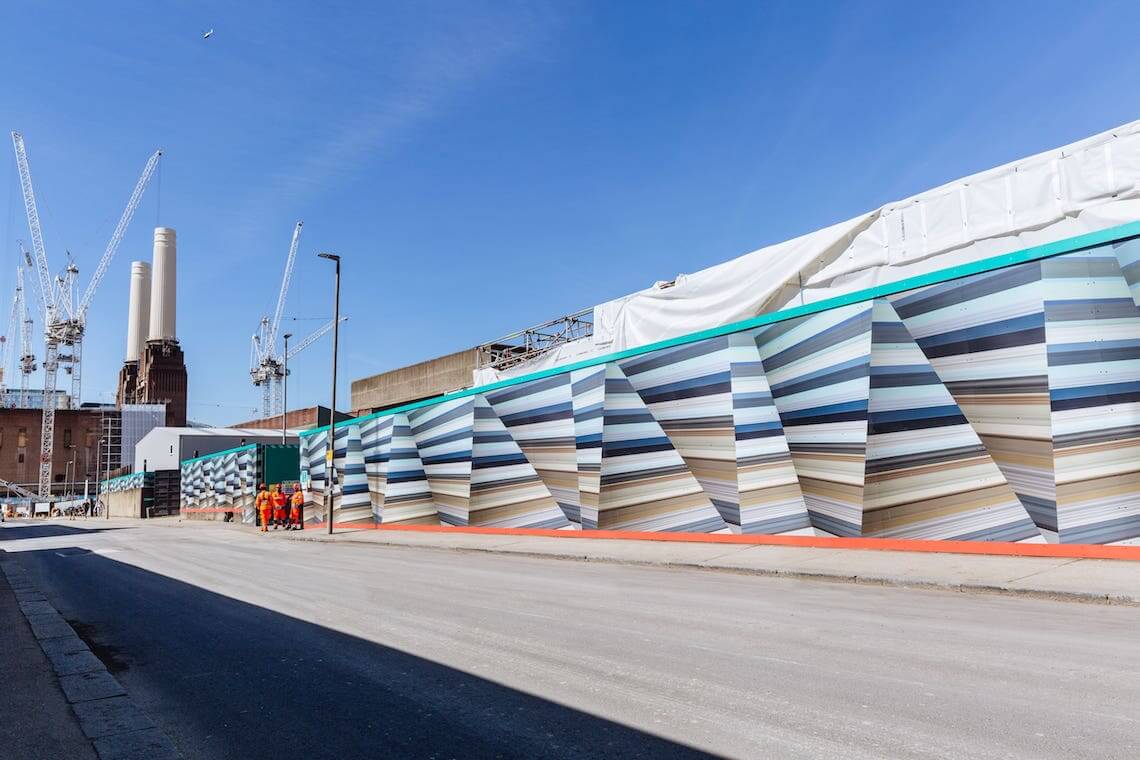
The genius of this design lies in the colour palette and selection. For each construction site, Tideway took samples of the colours that occurred in the surrounding area (taking into account everything from roads to buildings and trees), and used these to create unique palettes to use.
The result is a series of designs that use the same pattern, but with colours taken specifically from their surrounding areas. This innovative approach means that the hoardings ‘blend’ on a subconscious level, but still stand out as effective graphics in their own right.
Final thoughts
With any form of outdoor advertising there is almost limitless possibility, and with a creative approach even the most mundane of installations can be transformed into an eye-catching and memorable advert. Whether you’re providing an experience or trying to drive conversions for your business, there are always ways to go about this that break the mould, and get people talking.
If you’d like to discuss a hoarding graphics project, don’t hesitate to get in touch via our online contact form – our specialist project managers are happy to provide quotes and advice, and will get back to you very shortly!