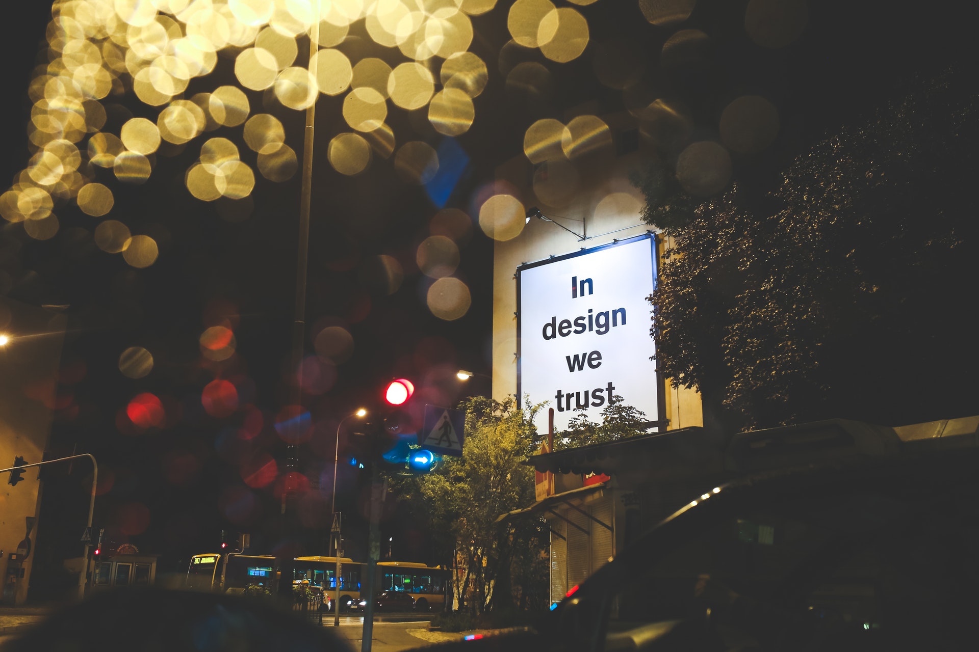
Looking for some advice?
Despite the ongoing challenges presented by Covid19, we’re here to help. If you’re working on a large format project, and have any questions, please get in touch via our contact form – our expert project managers are on hand to answer any of your questions.
The process of designing graphics for large format printing requires a slightly different approach to that of other channels. Practically speaking, there are certain things that designers will need to consider, such as which software you use to design and deliver your work (for more info, take a look at our practical guide to designing large format graphics – to be linked)
But it’s not just how you design your work practically, but creatively, too. From your use of fonts to making the most of ‘negative space’, there are a few specifics you’ll need to consider when designing large format graphics – get them right, and your work will not only be seen, but remembered, by a large number of people.
Less is more
Generally speaking, large format graphics are seen by people ‘in the wild’. Often they’re walking or driving past, and usually their focus is drifting. As a result, you’ve potentially only got a very short window to leave a lasting impression with your design – and in this context, less is more.
You’ll need to consider the best ways to convey the intended message effectively, and present it in a way that’s memorable, visible from a distance, and easily digestible.
The fewer complex elements in your design the better, both in terms of visuals and messaging. Simple, bold shapes work well, as to images that aren’t too ‘busy’. When drafting your first concepts, ask yourself the question ‘what is the key message?’ and then at every draft stage: ‘could I make things simpler, and clearer?’
It’s worth adding that this doesn’t mean your graphics have to be plain or lacking in originality. If anything, it’s good to see this is as the creative challenge it is: ‘how can I leave a lasting visual impact in a simple, bold way?’.
Choosing fonts:

When it comes to large format design, fonts serve a more practical purpose than in other channels. The fonts you choose will be the vehicles which carry the message of your design, so it’s important that they’re visible, clear, and impactful.
The main things you’ll need to consider when choosing an appropriate font include:
Where the graphic will be displayed:
find out how large the print will be, where it will be placed, and from how far away people will be able to see it.
Keeping it simple:
Simplicity is usually the best option. If your chosen font involves intricate details or is difficult to read, it likely won’t work well in a design that will only be seen briefly.
Kernings:
The letters need to be clearly distinguishable from a distance, so appropriate kerning (the distance between letters/characters) is important.
Thickness:
If a font is too bold, it can appear messy, but it’s also important to ensure the letters aren’t so thin that they can’t be seen against the background.
Font sizes for large format printing – typography guide
Once you’ve found out how your design is going to be displayed, you can use this simple formula to calculate how large your font will need to be:
Viewing distance (in feet) x 0.034 = Height of text (in inches)
Height of text (in inches) x 72 = Point size of text
By way of an example, a few measurements include:
Viewing Distance Text Height Text Point Size
4.5 metres 1.3 cm 37.8pt
6 metres 1.8 cm 50.4pt
9.1 metres 2.6 cm 75.6pt
A practical note:
On the more technical side of things, think about whether or not your chosen font will translate between different operating systems. If your font is Mac-specific, and your designs are transferred to a PC at the print firm, problems can arise.
If you’re designing your own font then this likely won’t matter, but it’s worth considering when using stock options. Also, ensure that all fonts you use (particularly if you’re designing them yourself) are presented in vector file format, as these need to be completely sharp at any given size.
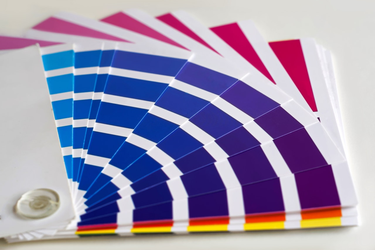
Contrast, colour, context

Your use of contrast and colour are two of the most important factors in how effectively your design can be seen – but these two mean nothing without context.
Take, for example, a graphic that will be displayed in a shopping center, on a large banner. The design for this can often involve a fairly broad colour palette, and some slightly more intricate visuals, because people will be able to view it for a comparatively long time.
Compare this with a bus advert, or a design for a roadside billboard, and it’s a different story altogether. Passersby will likely only be able to see this adverts for a few seconds, so there needs to be no room for confusion over what is says or shows: these designs need to leave a flashbulb impression on a viewer.
This context should have a big impact on your choice of colour, and your use of contrast. For simple designs that need to make a fast impression, high contrast between the text and background, as well as the other visual elements to the design, is key – and a simple colour scheme, with up to 3 colours, is usually most effective.
If you’ve got a little more leeway in terms of context, don’t get carried away. You need to make your designs colourful and exciting enough to attract attention, but not so overworked that they end up difficult to digest.
Fading = banding
It’s worth noting, while on the subject of colour, that large format printers can sometimes struggle to effectively print faded colours. This isn’t always the case, but it can create what is known as ‘colour banding’, which is when faded colours appear in descending strips, instead of transitioning smoothly.
Have a chat with the company who will be printing your work, to find out how their machinery might impact how you can approach your designs stylistically.
Print test copies
Test copies are a vital stage in the creative process, particularly with print work. It’s very easy to get caught up in the screen, and forget that your work is going to look very different on paper.
Although your home or office machine likely won’t be able to print to the specs of a wide format machine (which should be the focus for your work – see our practical guide to designing large format graphics for more), you can still glean valuable insight from it.
At every stage of the drafting process, print out your work in as large a version as possible, then scale the viewing distance down as necessary and take your work in. Consider how readable it is, if it’s clear, and if any elements get lost in the design layout.
This is also a great stage to get honest and open feedback from some people you trust – let them see your printed work, and relay how effectively they think it achieves the brief.
Keep things spaced out (negative space)
With large format graphic design, it’s important to strike a very fine balance when it comes to negative space (the space between visual elements). You need to ensure there aren’t too many sections to your work and it isn’t too busy, which can be achieved with careful use of spacing.
Keep the number of graphics and other elements to a minimum, and lay these out carefully. Bear in mind about the physical act of viewing your work – try not to leave things looking empty, or spaced apart in such a way that viewing them requires an impression of a Wimbledon spectator.
Top Tip:
Think about the layout and spacing of your designs almost as a ‘visual narrative’. What’s the first thing you want your audience to see; what will they be drawn in by? Where will they look next? Plot out a step-by-step plan for how you want your work to be taken in.
Again, the simpler the better. 1-3 stages at most is usually the best bet, particularly for graphics seen by those in cars. Once you have this in mind, use it to physically break up the visual elements of your design (or to effectively blend them together).
What substrate is it going to be adhered to?
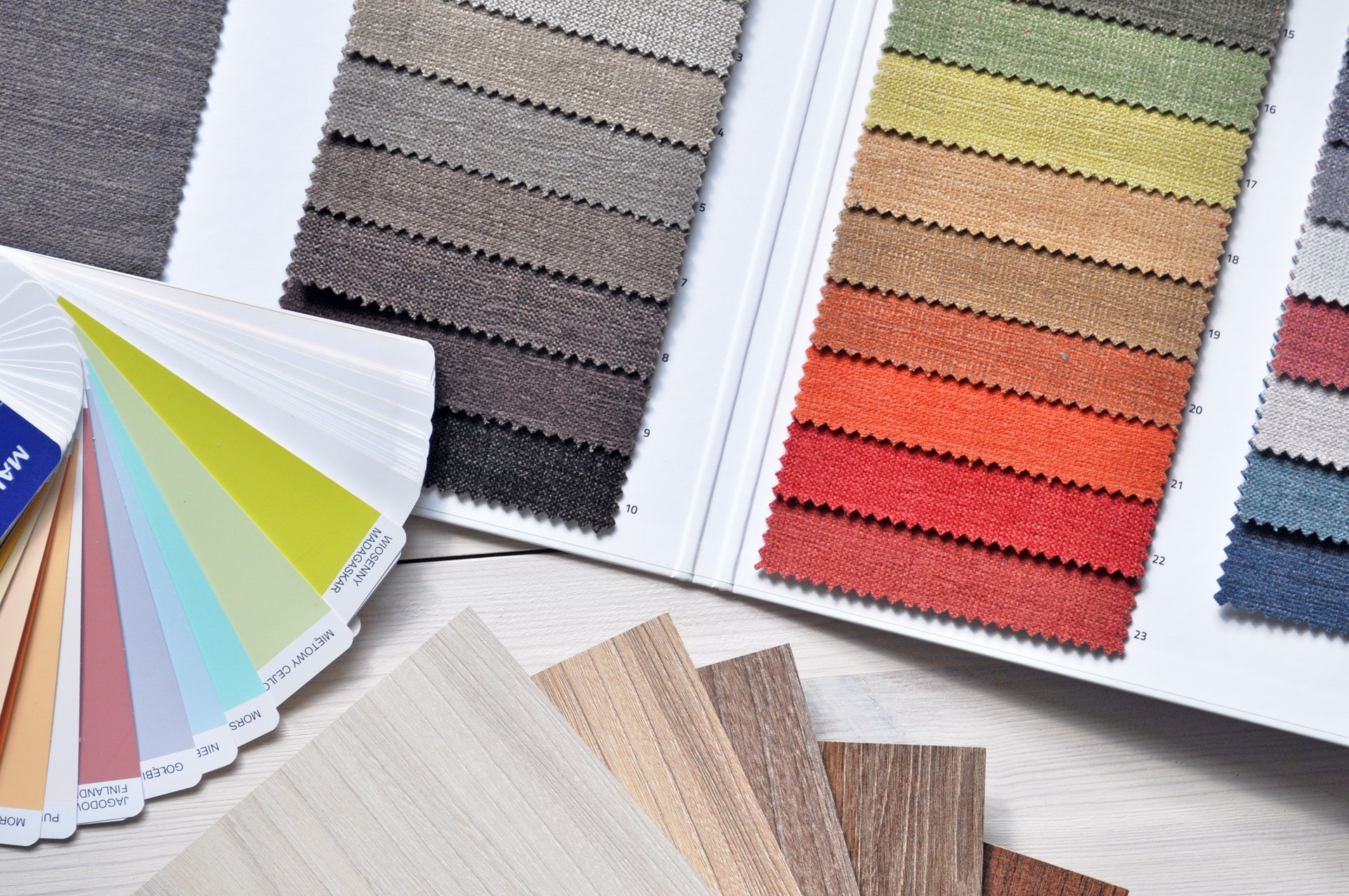
In printing, the ‘substrate’ is the material that gets printed onto. This might not seem important, but as technology enables printing firms and creative marketers alike to print onto a variety of different materials and surfaces, there are big implications for the designers.
The simplest way to factor this in is to discuss things with the printing firm you’ll be working with. Find out what material they’ll be printing onto, and if this will react differently to different kinds of designs. You’ll need to determine its colour, and texture, as these may restrict certain design elements.
Conclusions – don’t feel boxed in
For a creative designer, large format printing presents a genuinely exciting opportunity. It can, however, feel a little bit like the practical implications of printing restrict how creative you can be during the design process. This isn’t the case.
While the points mentioned above are well worth considering, the nuances of large format printing can actually force the hand of a good designer, into creating work that’s inspired, original, and memorable. It’s a challenge, certainly, but it’s one that the best designers will use as an opportunity to create their best work.