Looking for some advice?
Despite the ongoing challenges presented by Covid19, we’re here to help. If you’re working on a large format project, and have any questions, please get in touch via our contact form – our expert project managers are on hand to answer any of your questions.
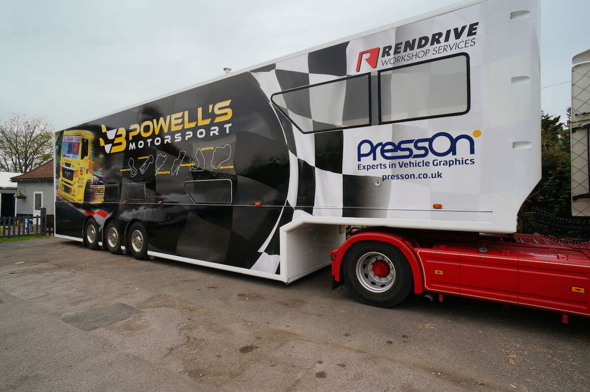
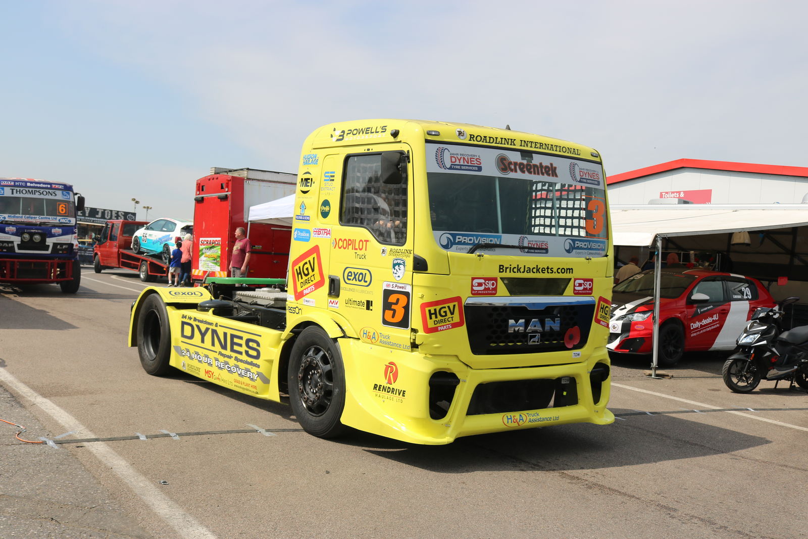
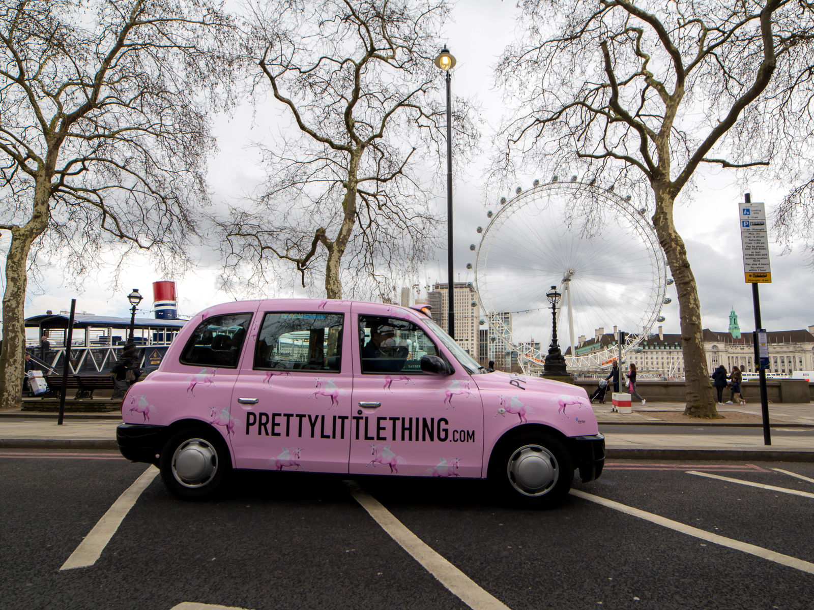
Vehicle graphics are an impactful, cost-effective form of outdoor advertising. They leave a lasting impression on the consumer, and can elevate a business’s exposure – but designing them presents a unique challenge. In this guide, we’re taking a look at how to design fleet graphics for vehicles. Whether you’re a new designer, or are brushing up on how to put these graphics together, read on…
Caveats
First, it’s important to go over a few caveats. While there are plenty of universal steps to go through and tips to impart, there’s no ‘one size fits all’ approach to designing vehicle graphics. There are a lot of variables at play, from the type of software you plan to use, your client’s brief, the type of vehicle you’re designing for, and the available budget.
With all of this in mind, the first (and possibly best) piece of advice we can give, is that if you have any doubts or uncertainties, get in touch with your print supplier. A good print specialist, like the excellent project managers at PressOn, will always have the time to work with you to ensure any concerns are ironed out.
Key considerations
With this in mind, there are a few design principles to bear in mind about vehicle graphics, which will probably apply regardless of what or who you’re designing for. These mostly relate to the issue of clarity, in the context of a moving vehicle.
Vehicle graphics are unique in the sense that they’re often viewed in motion – on a passing car, truck, or van. For this reason, when you approach the design process, it’s vital to think about how you’ll ensure your graphics can always be seen clearly. A couple of useful pointers include:
Keep it large. The larger and bolder the visuals on your design, the easier they will be to take in at speed, quickly. Fine details, small images, or fiddly text can be very difficult to read, so they’re best avoided.
Keep it simple. The more simple and clear the visual elements of your design, the better. While it can be tempting to experiment with the unique format, and explore unusual shapes, styles, and imagery, it’s best to always keep things as pared back as possible to ensure your branding or messaging hits home with every passerby.
Step 1: Make effective preparations

Before you fire up the computer or put pen to paper, you’ll need to make some arrangements and preparations for the designs. Firstly, it’s a good idea to get a hold of some pictures of the specific vehicles you’ll be designing for, from several angles – and if possible, visit the vehicle in person. This will give you some much-needed context, and might shed some light on some things that could impact the way you go about drafting.
You’ll also need to speak to your client, and confirm the messaging and any copy that will be a part of the designs. This might involve logos, brand imagery, or simple a slogan – offering you more creative freedom. Check all copy, spelling, grammar, and make sure everything is signed off.
You’ll also need to source any photographic imagery that will be used in the design. It’s vital to use photos with the highest resolution possible, and generally, it’s best to avoid using photography for vehicle graphics at all if possible – it’s very easy for images to distort or become pixelated when printed.
Finally, you’ll need to get some templates for the vehicles to use for your final designs. These can be found online at sites such as this one, or you might be able to get one from the client or the manufacturer. You might, if one is not available anywhere, have to make one yourself from photographs. You’ll need to be extremely precise and careful if so – tracing templates around the edges of photographs of the vehicle can be a good solution.
Step 2: Draft a design
Before you put your final template together, you’ll need to draft up the concept and basic look for your design. A good way to go about this is to start on paper, or your medium of choice, to put together the basic visual elements you’ll be using.
Once you have these in mind, take your photograph of the vehicle in question and use a program such as Adobe Photoshop to put together a simple mockup. This is a great tool for seeing how your final design will look when it’s adhered to the actual vehicles in question – and it’s a great idea to send it to your clients or managers to get their sign off or feedback.
(Whatever route you choose to take, sign off is essential – changes can be extremely costly and time-consuming if they need to be made after printing has already taken place)
Step 3: Finalise the design
With the draft concepts signed off, it’s time to create the final template which will be sent to your print supplier for production. How you go about this is up to you in terms of software and technique, but there are some things to bear in mind, and a bit of advice we’d impart.
Firstly, have a chat with your print supplier about the file types and colour modes they will need – often, Adobe Illustrator files set to CMYK are best, but this will depend on the machinery and tools used by the print team.
With this confirmed, set about creating your designs for the various faces of the vehicles – load the templates for each face/side of the vehicle into your program, and save each one as a separate file for the sake of ease and efficiency. Creating each section of the design for the faces as a separate layer is also a good plan.
If you’re using photographic imagery, use raster images or very high resolution files. Make sure all fonts are converted to outlines, to ensure they retain their definition when printed full size. It’s good practice to add plenty of bleed, so the design can be wrapped easily when printed, but confirm if this is needed with your print supplier.
Top tips

With all of the above in mind, when it comes to the actual designs you create, there are a few principles that can be very useful to adopt. While these won’t apply to every campaign, they’re generally quite helpful:
Less Is More
If in doubt, keep things simple. For vehicle advertisements, less is almost always more – particularly when it comes to writing and text. Keep copy short, snappy, and to the point. A logo, short sloga, and phone number & website is often enough. A full address can be hard to read on a moving vehicle.
High contrast is great
The more contrast you can include in your imagery, the better. Contrast makes adverts easier to see from a distance, which is particularly useful for vehicles in motion. Complementary colours are usually a good way to achieve this!
Keep it clear
Depending on the nature of the campaign or branding you’re designing for, you’ll likely have one message to communicate with your drafts, whether that’s ‘this is who we are and what we offer’ or ‘we have a seasonal sale on!’. When getting this message across, be as clear and direct in your imagery as possible. You might be a brilliantly intellectual creative, but vehicle graphics aren’t necessarily the time for clever visual puns or complex wordplay. Keep it to the point, keep it clear.
Want to know more? Get in touch!
If you’re planning to order a set of vehicle liveries, get in touch with us here at PressOn. Our experienced project managers are always happy to collaborate on a project, and help you make your visions for your vehicles a reality.